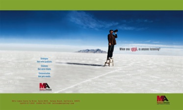
A small PR and Communications firm looking to attract new clients and new industries
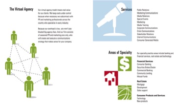
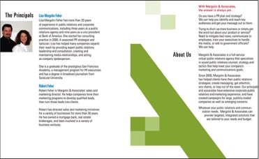
Challenge: Rebrand the company to communicate the menu of services offered as well as the virtual nature of the agency.
Solution: Created a new logo that emphasized digital collaboration, new web site graphics and an 8-page brochure that could be delivered digitally or by mail.

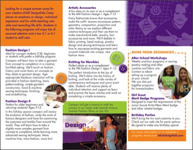
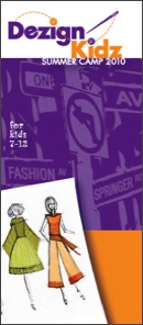
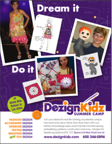
A company providing creative enrichment programs for kids in design and textile-related subjects.
Challenge:
Create an entire brand identity package including name, tagline and logo design, and apply it to a wide variety of ads, signage, packaging and promotional materials. Develop a web site that reinforces this brand image and provides functionality for payment and registration, a gallery, etc.

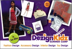
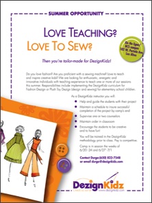
postcards
tri-fold brochure
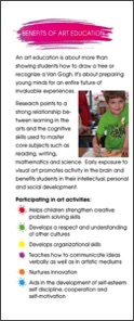
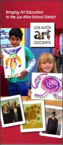
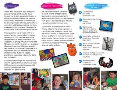
A non-profit group of trained volunteers who provide art instruction in the Los Altos School district K-6 classrooms.
Challenge: Increase awareness of the program in the local community and at school-site events to encourage recrutiment and foster support.
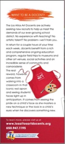
Solution: Leverage the existing logo and iconic red apron worn by the docents in a series of recruitment posters, a mural on the district office building, outdoor signage and a tri-fold brochure.
The recruitment poster campaign features artwork used in the program's curriculum along with copy that extolls the personal satisfaction derived from being a docent.
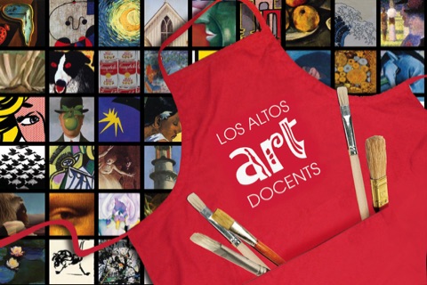
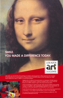
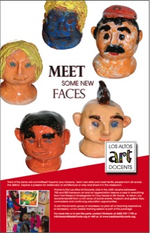
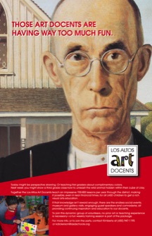
recruitment posters
tri-fold brochure
9-foot wide painted miral
business cards


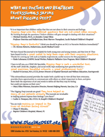

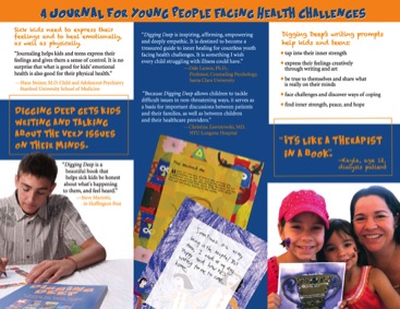
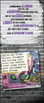
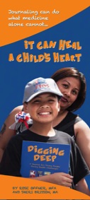
A Silicon Valley non-profit helping young people cope emotionally with serious illness
Challenge:
Design a brochure, web graphics, posters, ads and leave-behinds to be distributed at trade shows and hospitals and coodinate with the look of their existing journal for kids.

tri-fold
brochure
Ads
trade show signage
handouts
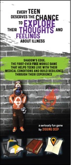
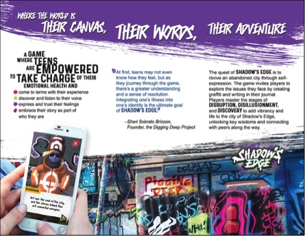
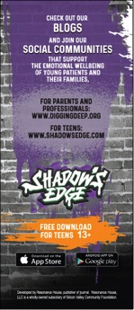
An gaming app designed for teens dealing with serious medical issues
Challenge: Design a tri-fold brochure to appeal to teens and caregivers that captures the feeling of the game
Solution: Leverage the existing logo and garffitti imagery and use blocks of colored spray paint to set apart text blocks.
